First Republic Bank
As a designer on a First Republic's internal creative team, I supported the Bank's 20% year-over-year growth, and over 60 east and west coast offices. In my time with First Republic, I touched nearly all marketing channels and verticals, finally supporting Private Wealth Management, New York region, and a company-wide rebranding effort. From 2018-2022, I completed over 550 projects, in close communication with teams across marketing and companywide.
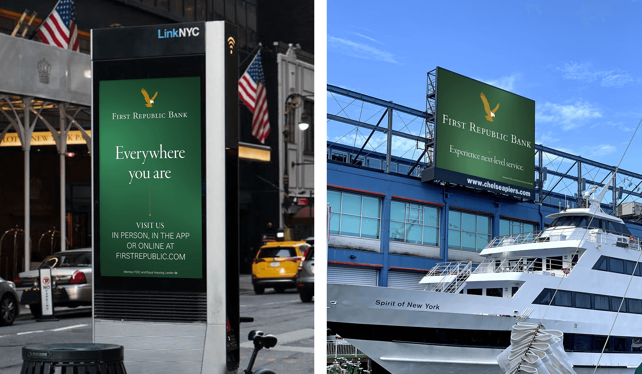
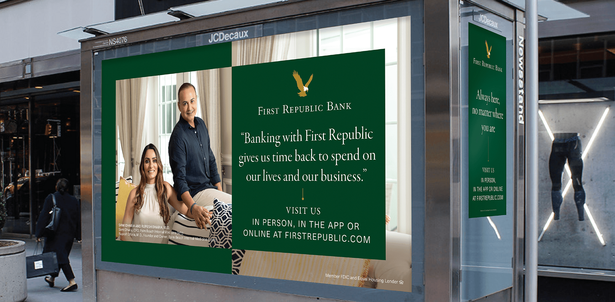
Brand awareness campaigns
This campaign generated a 10% brand awareness lift in New York, with 470MM impressions during 2021–2022. It spanned hundreds of static and motion ad variants on an array of out-of-home platforms in and around Hudson Yards, Grand Central Station, and Chelsea Piers. Originally developed by Moving Brands, I made several rounds of design iterations in response to user feedback over the course of the campaign's run.
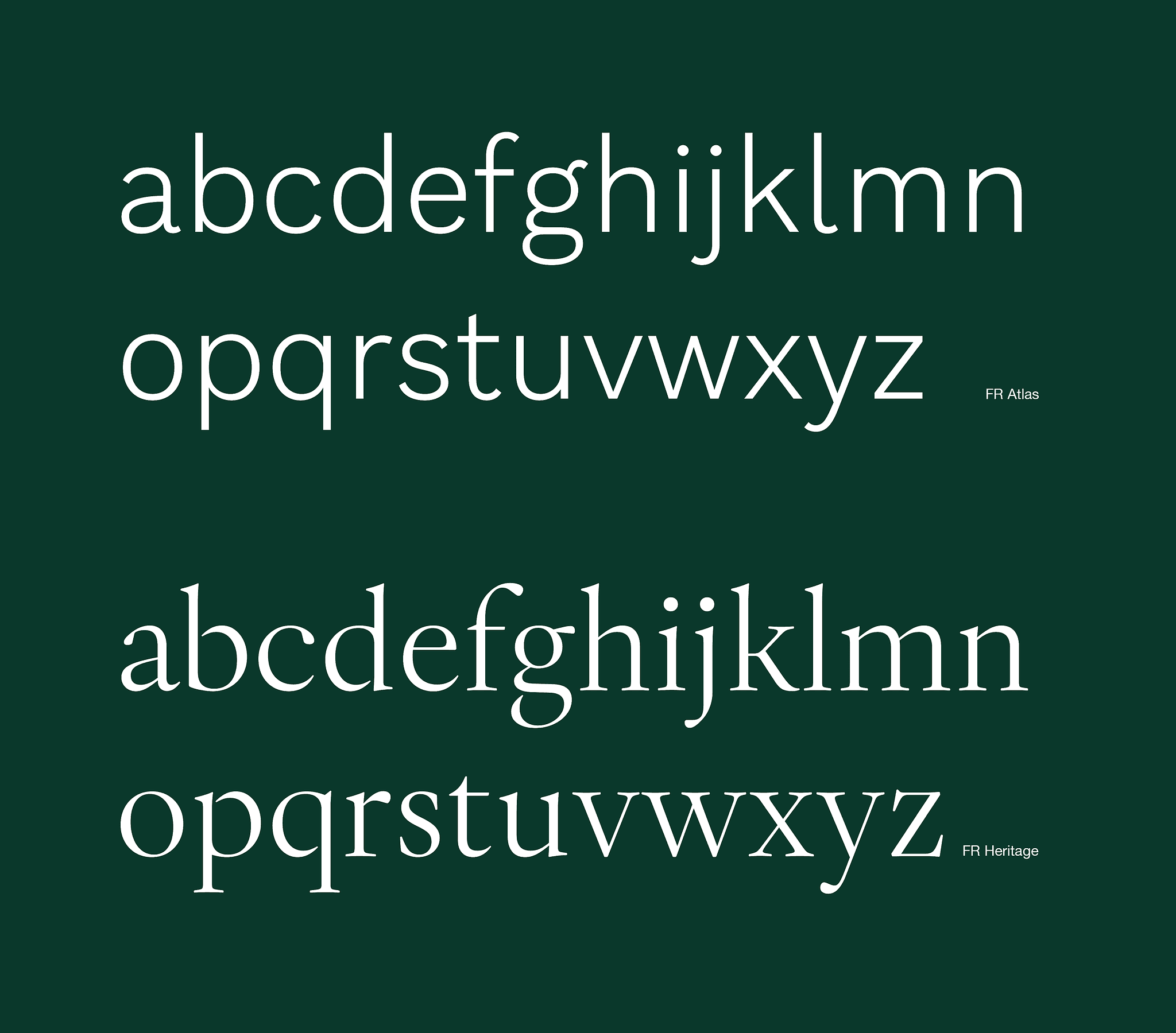
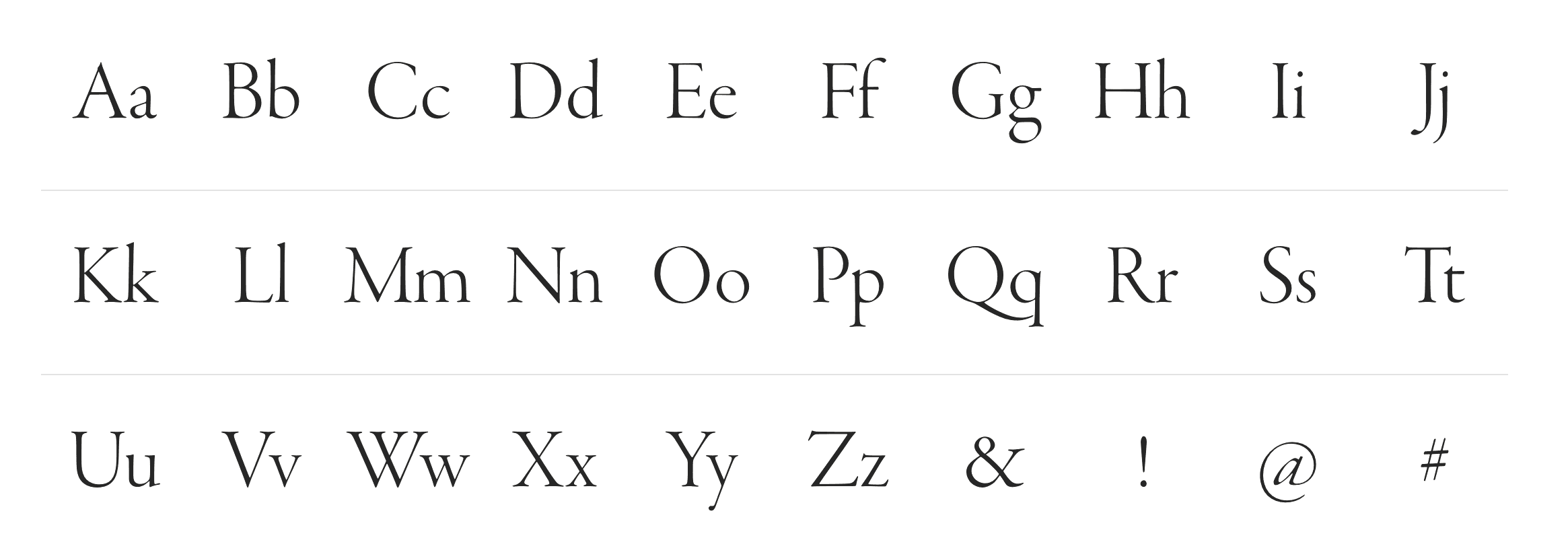
Proprietary typefaces
As part of a brand guidelines refresh for the bank, proprietary typefaces were developed in correspondence with type house Dalton Maag. The goal was to create ownable typefaces optimized for digital finance, while being appropriate across all media types. I gave feedback and guidance to the agency alongside a team of creative directors and VPs over about seven months' time. The design and feedback process varied from theoretical to technical, historical, brand-related, and so forth. The result was a balanced and contemporary sans serif optimized for finance and digital applications, and an expressive serif typeface with characteristics unique to First Republic, in both static and variable formats.
Digital advertising and social media
As part of my function with First Republic, I was responsible for the design and animation of a large portion of the content on social media, retail digital signage, and digital advertising.
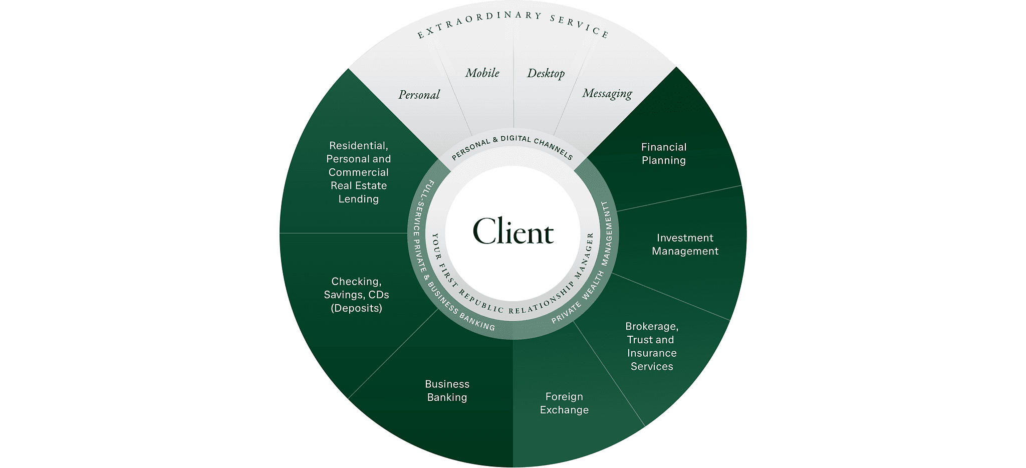
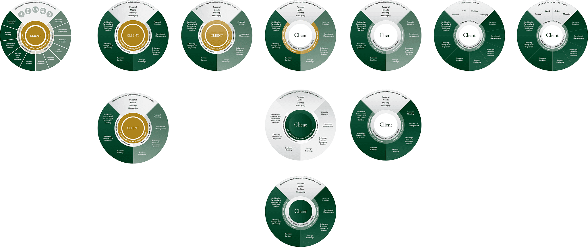
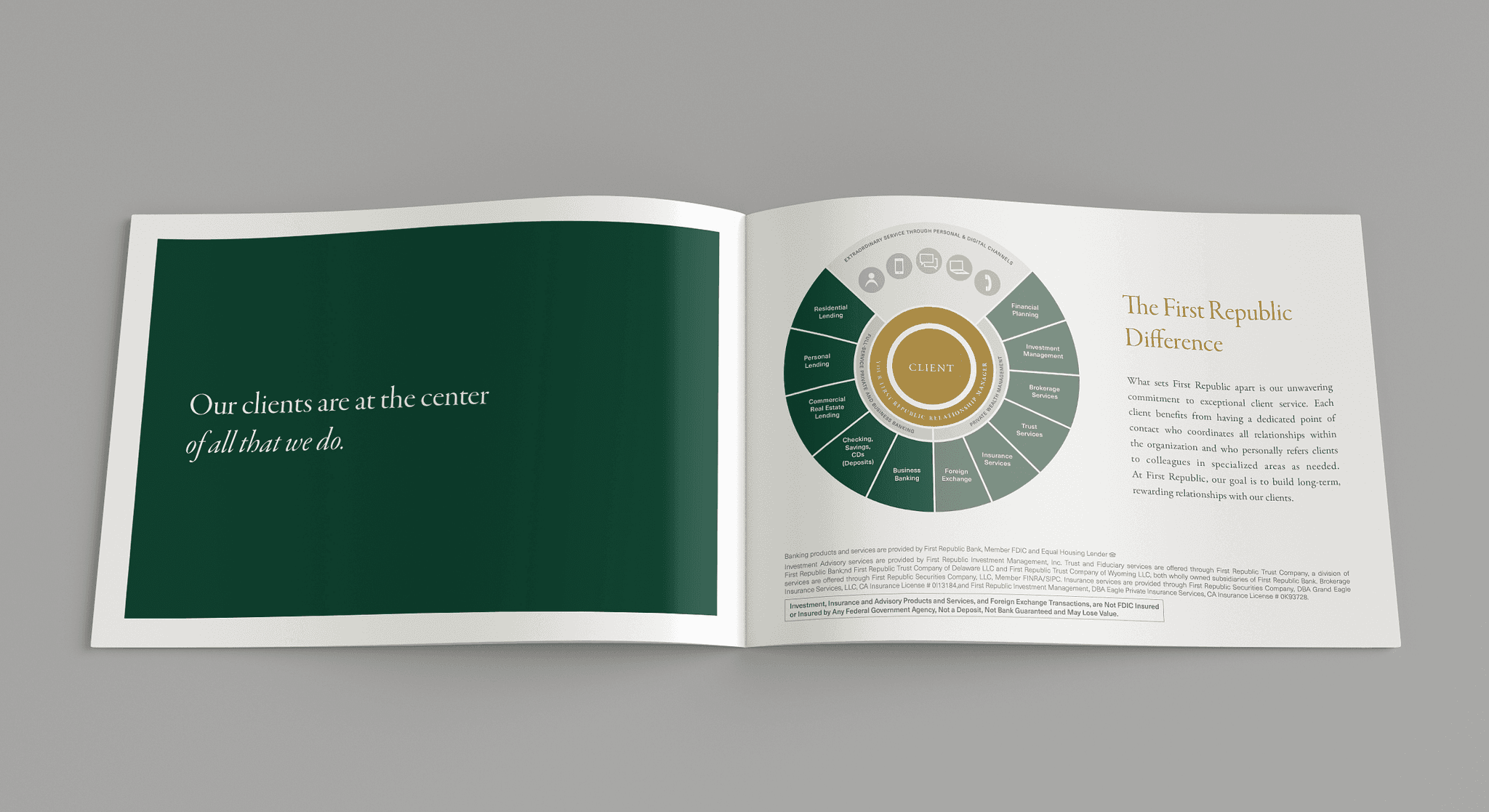
Infographic evolution
On this example, I worked to visually enhance one of First Republic's primary infographics, and brought it into alignment with evolved brand guidelines. Original artwork (shown bottom left) progresses to right to show my thinking.
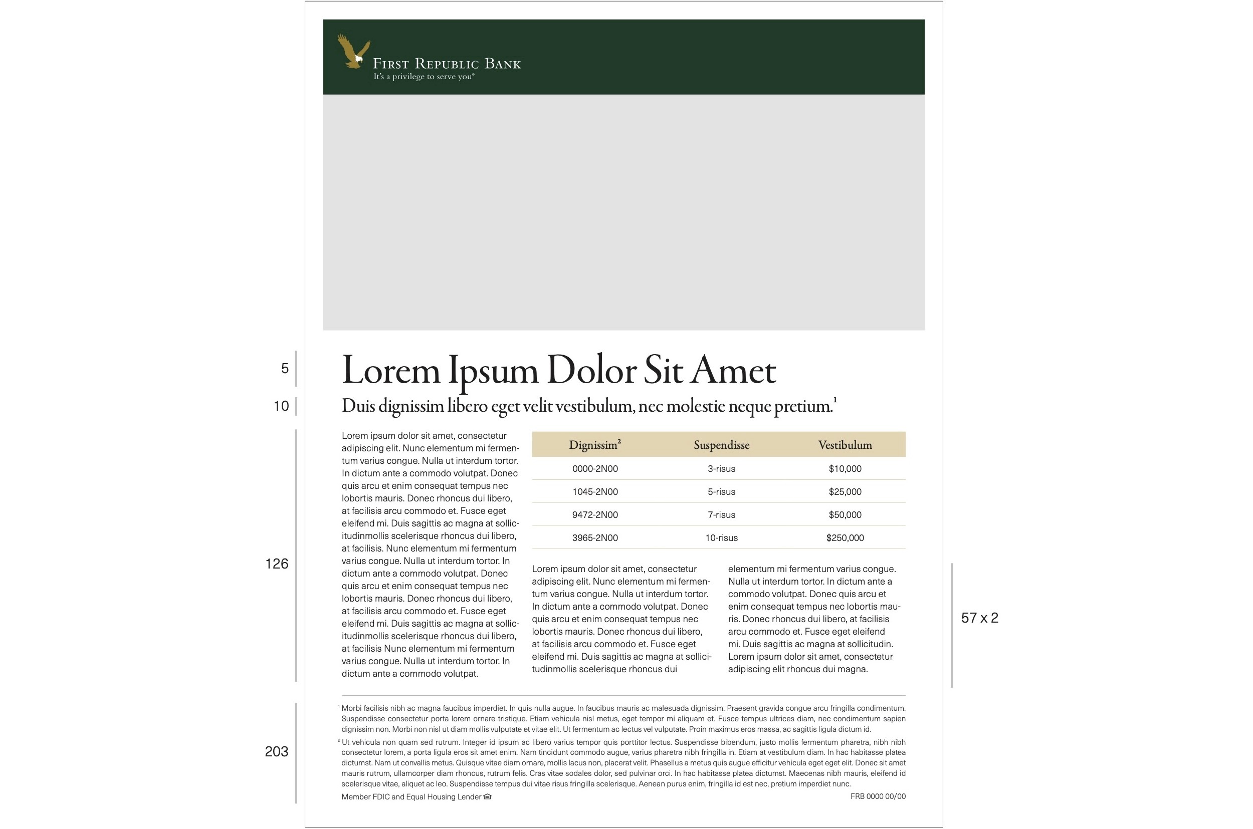
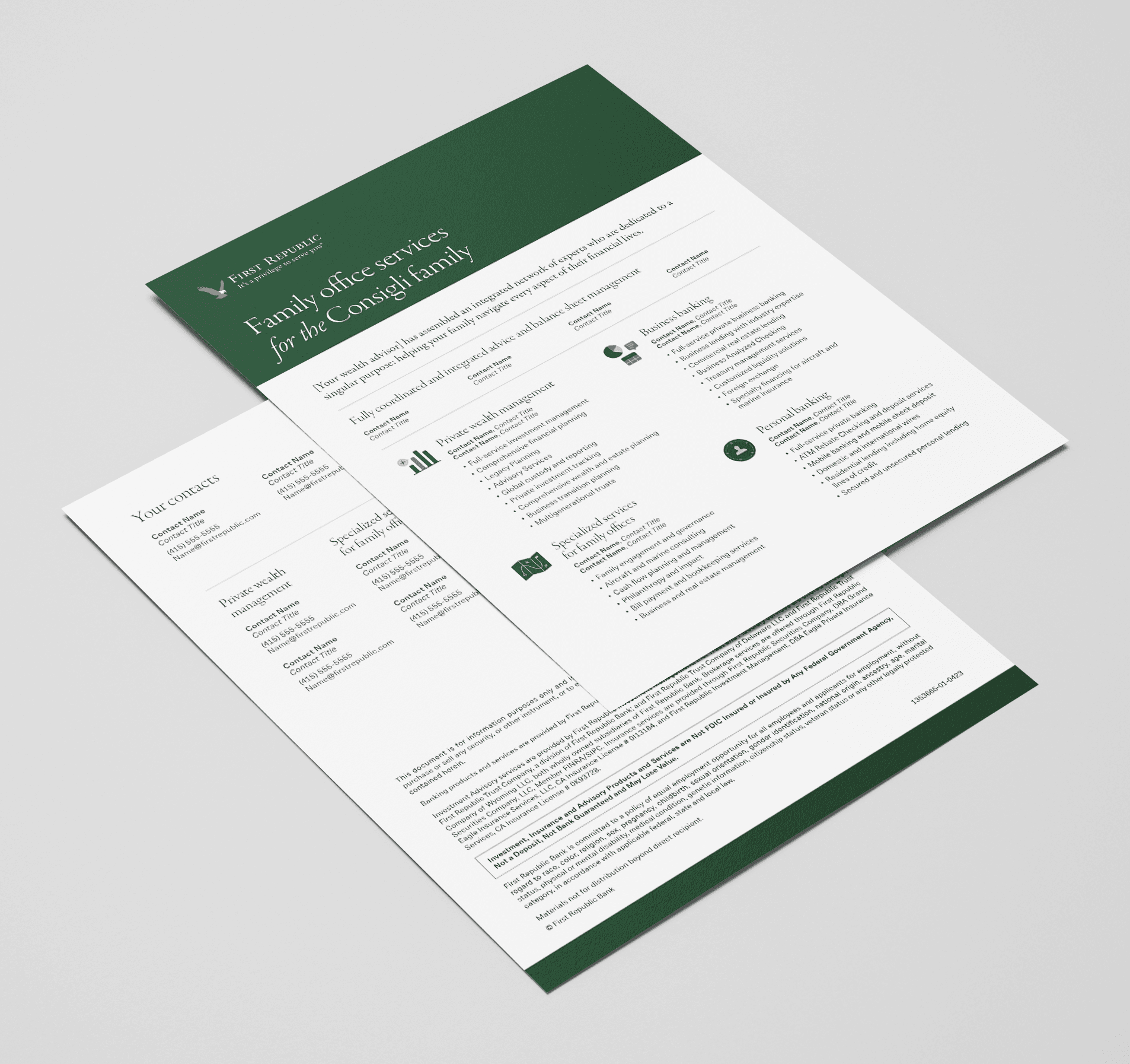
Business materials
Part of my role was to interpret business intent, user needs, and brand guidelines into final assets.
The ask for this specific example was to develop a customizable, complex infographic template explaining the hierarchy and functions of wealth managers. The precedent given was a tiered pyramid connected by a system of arrows, signifying the various relationships between services and wealth managers.
Upon experimentation, the infographic solution was not in line with existing First Republic collateral, branding, and user needs. Knowing this, I proposed this additional flyer option, stating services and contact information in accordance with user expectations and brand guidelines. In the end, this proposed solution was gladly approved by the creative leads and stakeholders.
Below the image of the finished product are some of the brand elements and guides that were incorporated into the final design.
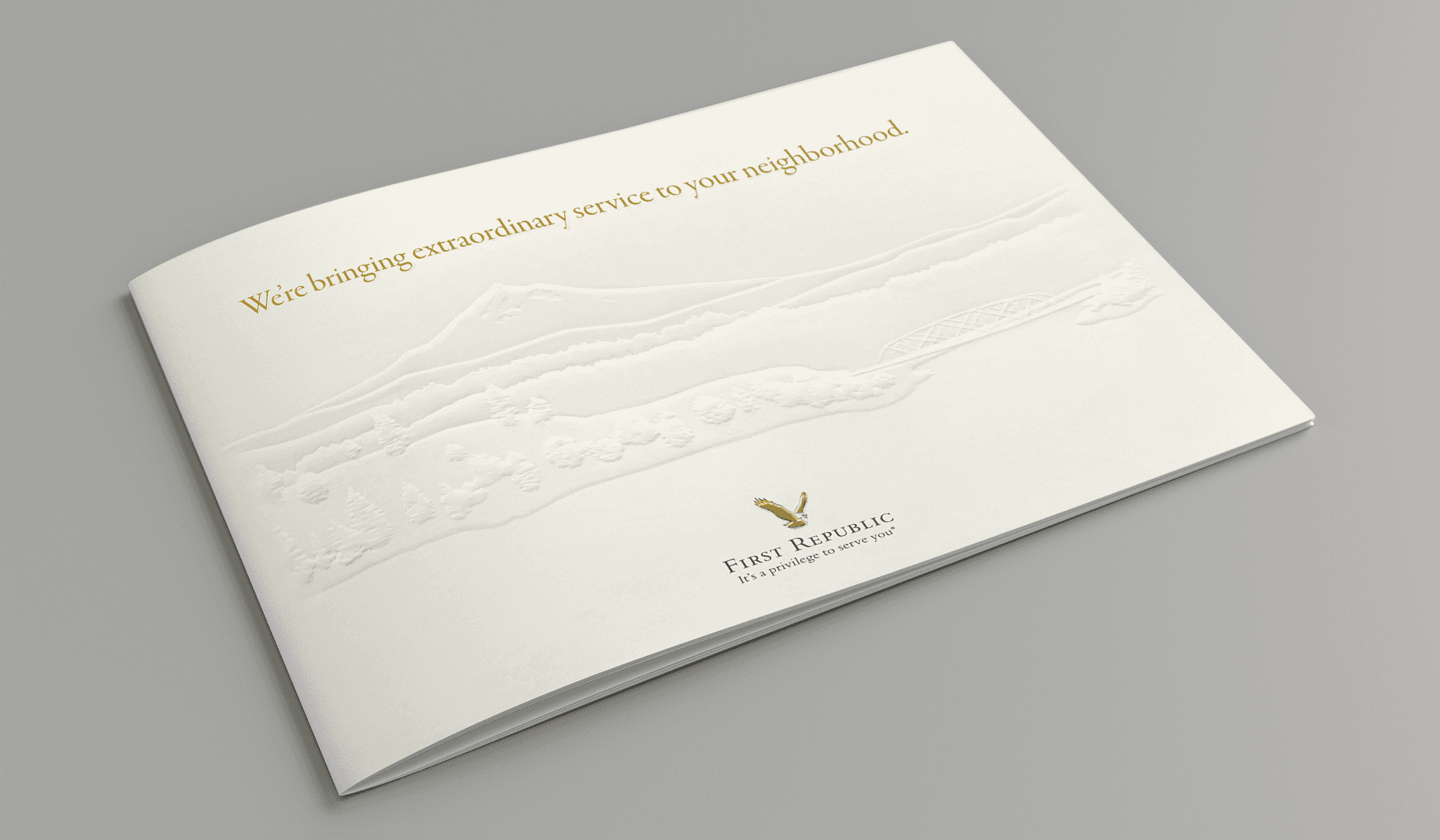
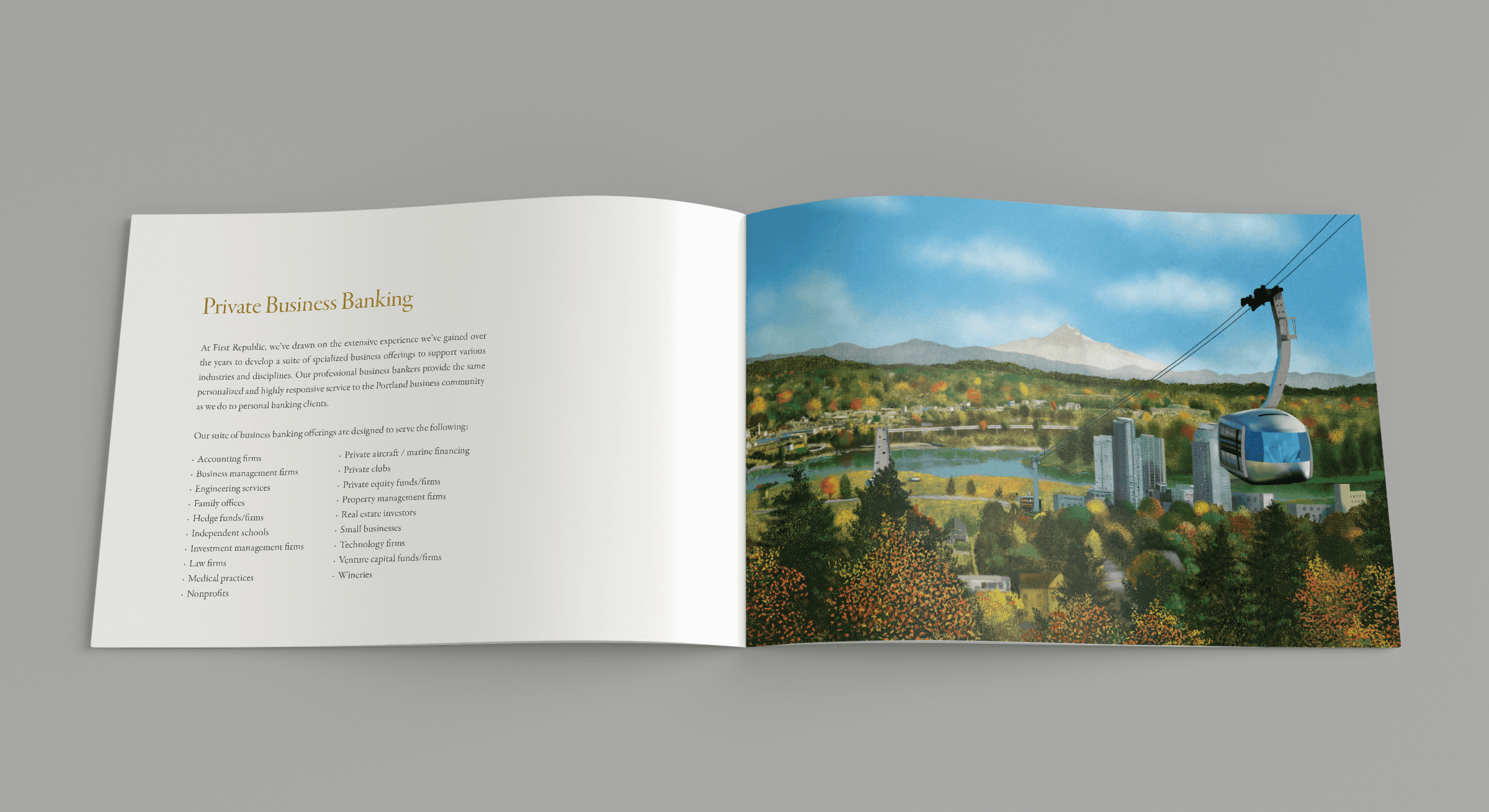
Direct mail for the ultra-high-net-worth
This was a pilot project in which I developed a regional direct mail template for ultra-high-net-worth prospects— particularly clients in the Portland area with minimum net assets of $50MM. Working with a senior art director, copywriter, and illustrator, we landed on this design featuring custom blind embossed and full color regional illustrations to anchor the piece to place, while aligning with direct mail cost and design constraints, target user expectations, and business need.
Result: An initial rollout brought in $3MM in deposits to the Portland offices during a short period, enough to prove success and initiate rollout to additional regions.

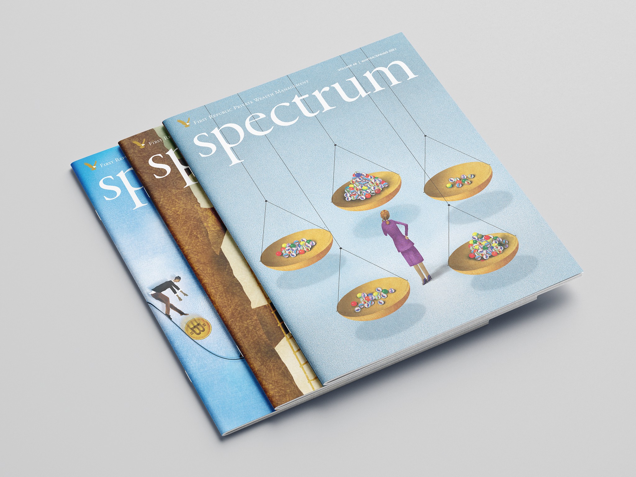
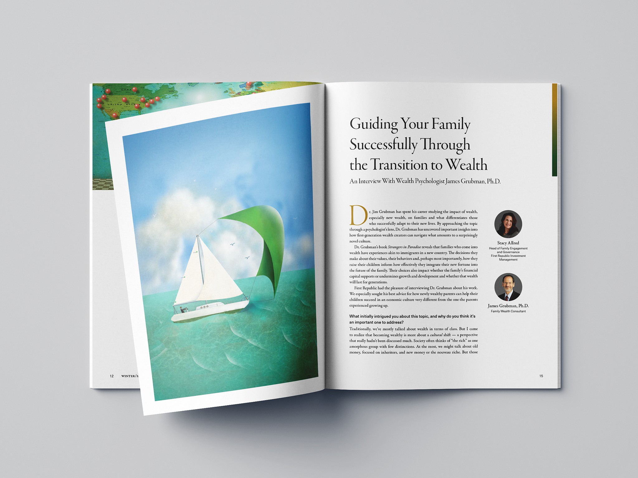
Wealth management newsletter
I created this template to port a legacy wealth management newsletter into an updated magazine format. Working with a senior art director, this look and feel for cover and interior spreads was established. Additionally, I did the production on the first few issues of the magazine before it was outsourced.
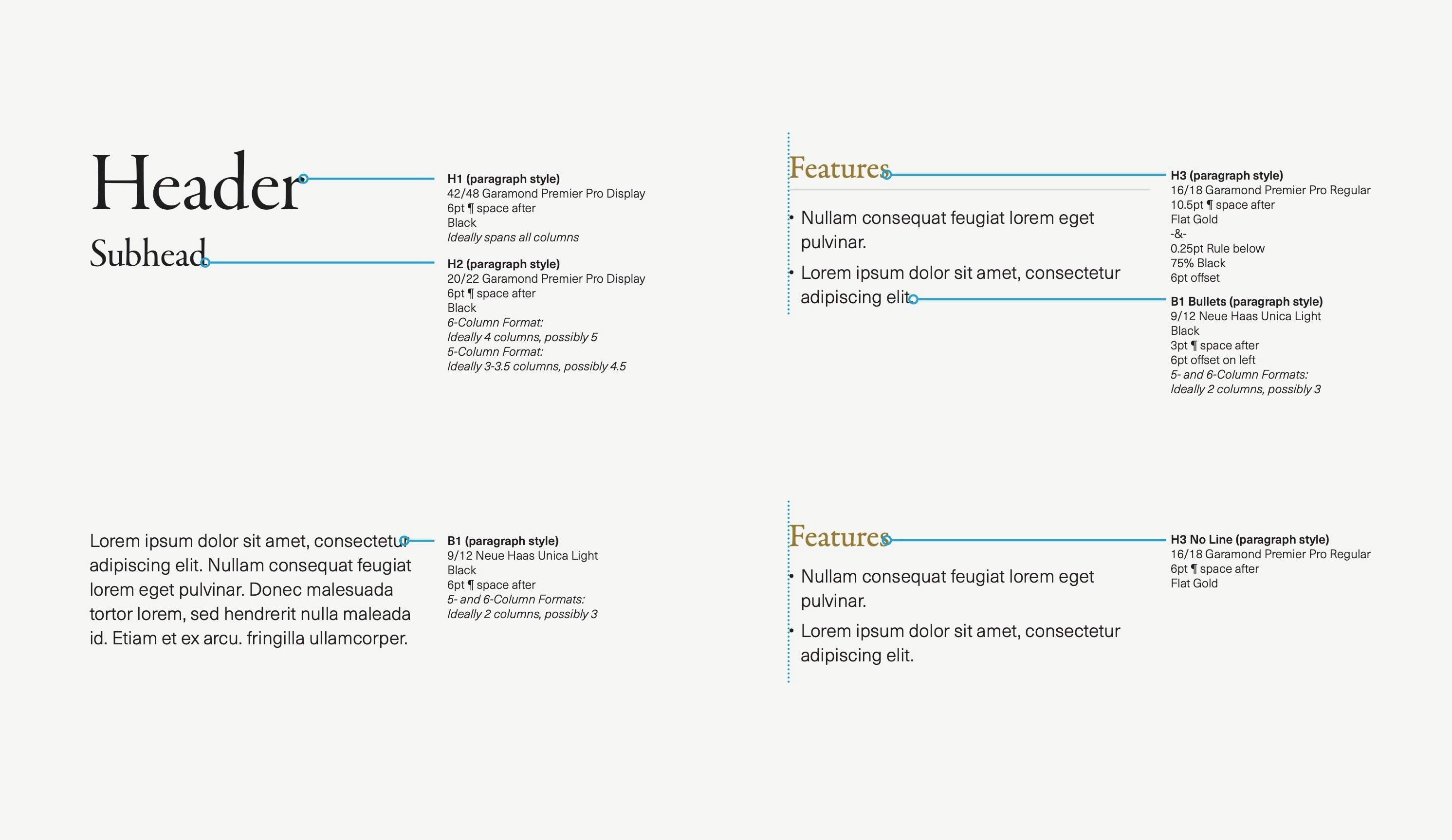
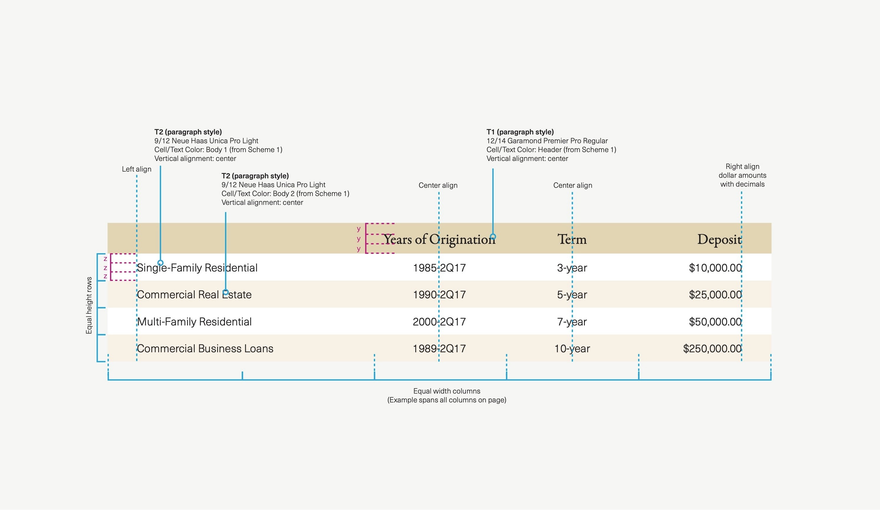
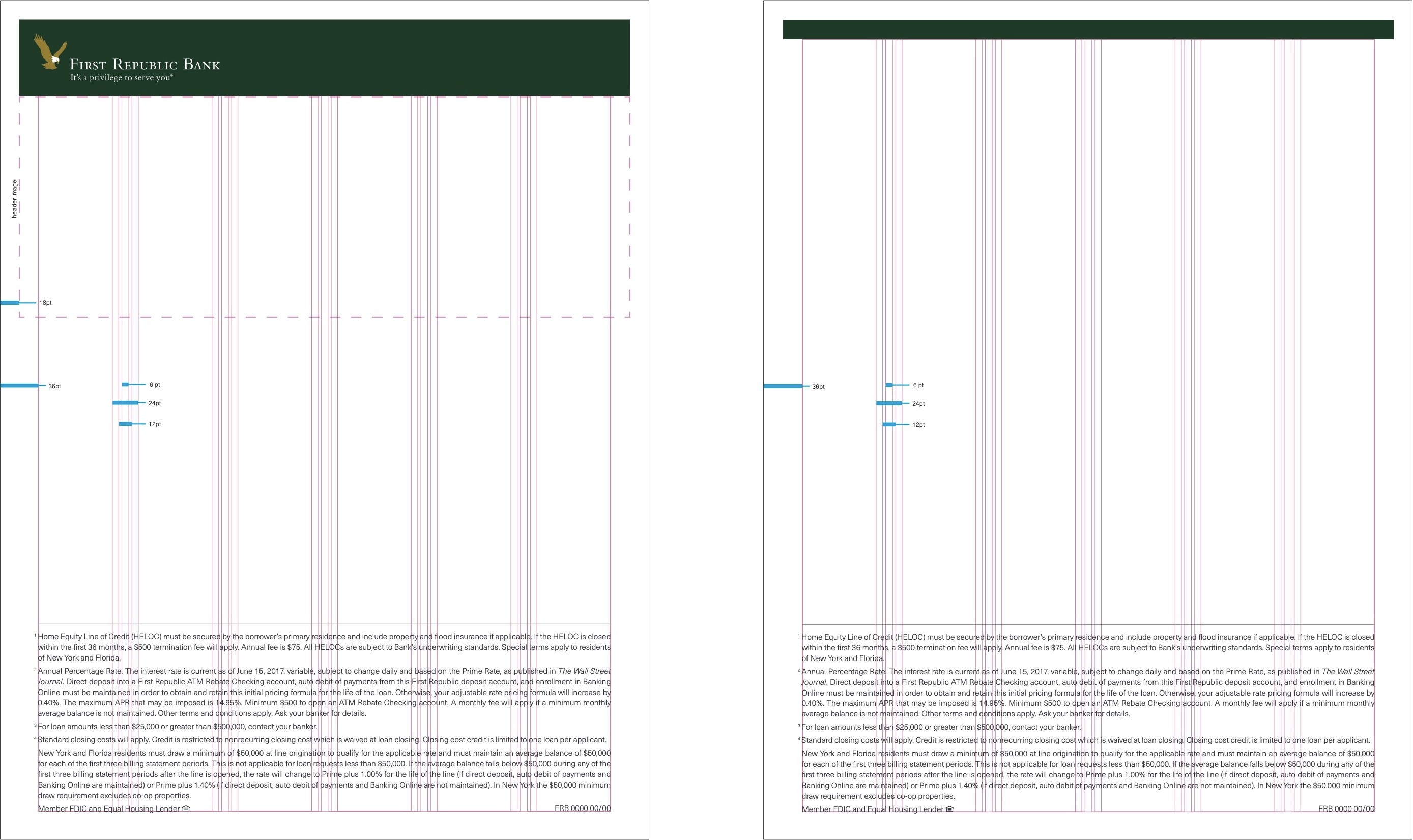
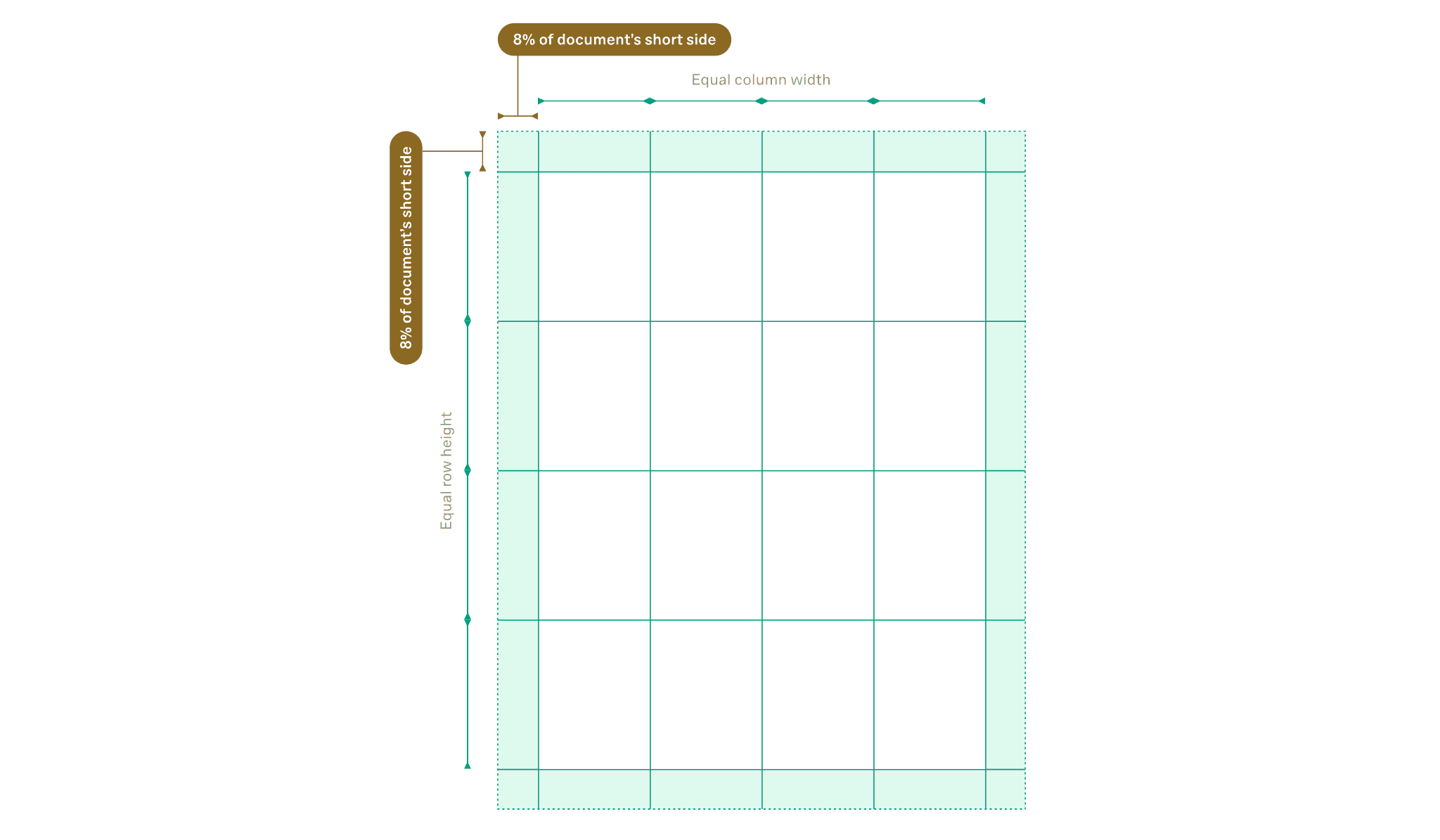
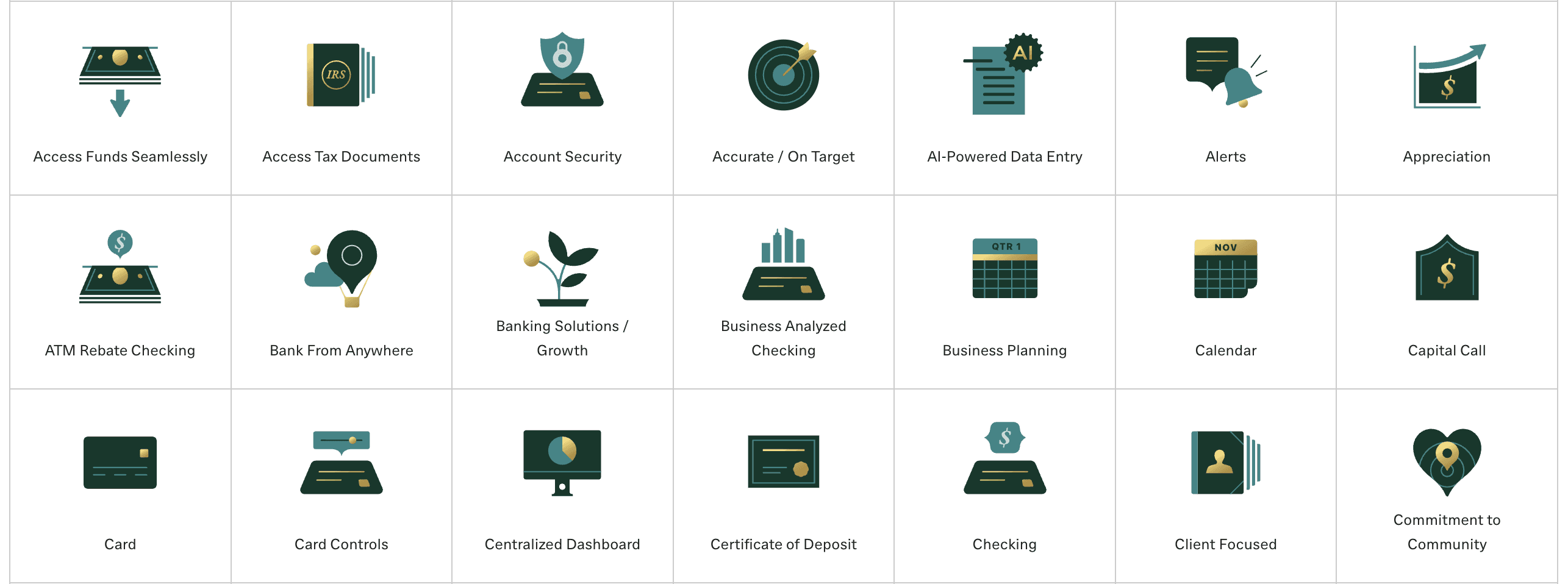
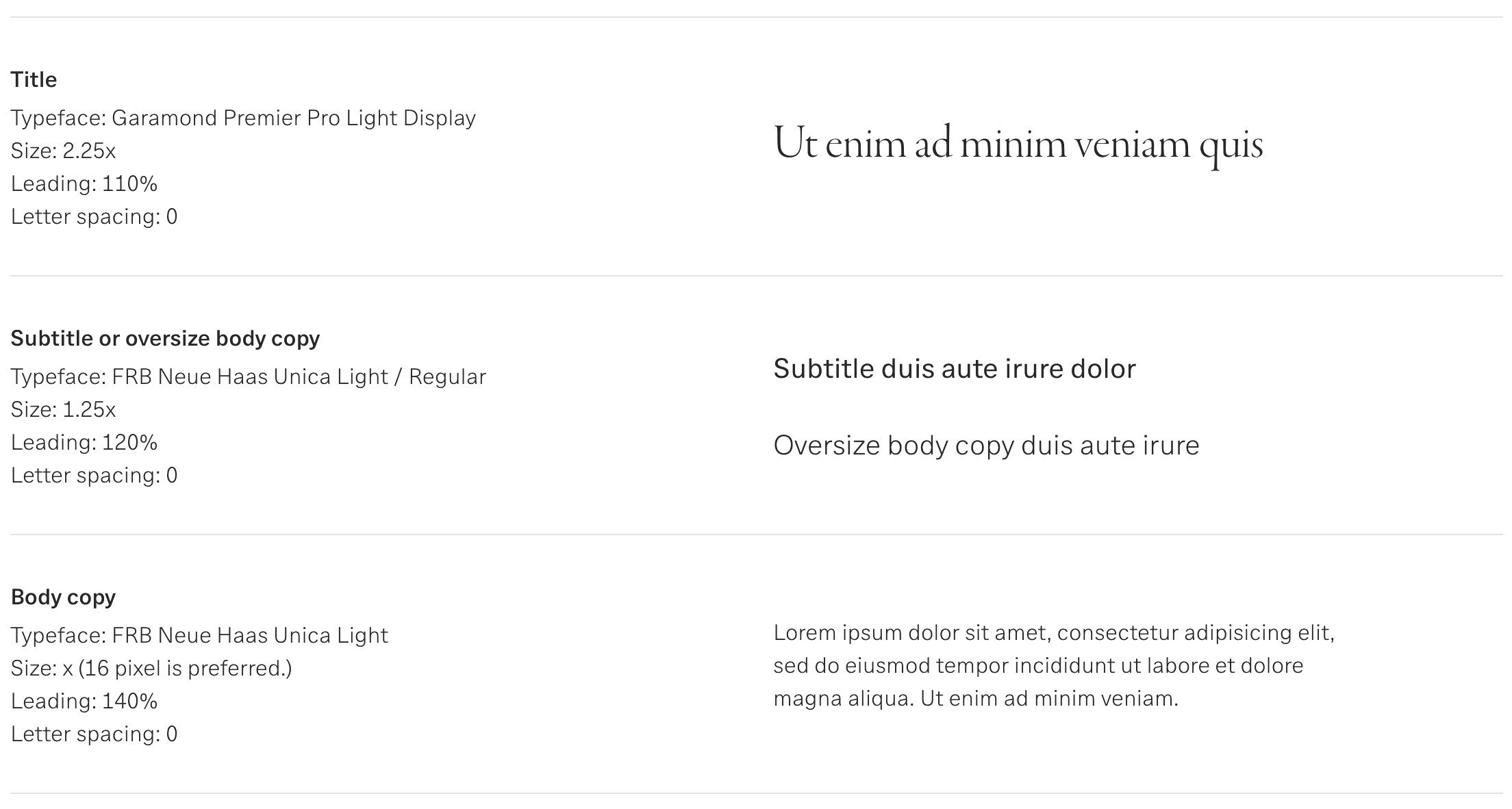
Design guidelines and templates
One of my first projects with First Republic was to develop a design guideline and template documents for the many one sheets produced both in-house and by vendors, using the brand expression as it existed at the time. Shown here are a few elements from that document, based on explorations done with the creative lead. The result increased both efficiency and consistency across assets and designers, while also providing a building block for later guidelines.